Category: Artists

How To Fix Damaged Watercolour Paintings

Every type of damage in a watercolor painting has different procedures in order to clean and restore them. These procedures cannot reverse color fading but it can help prevent and stop further fading. Here are some tips that you can do for each type of damage.

how-to-fix-mistakes-in-watercolor1

Water Damage
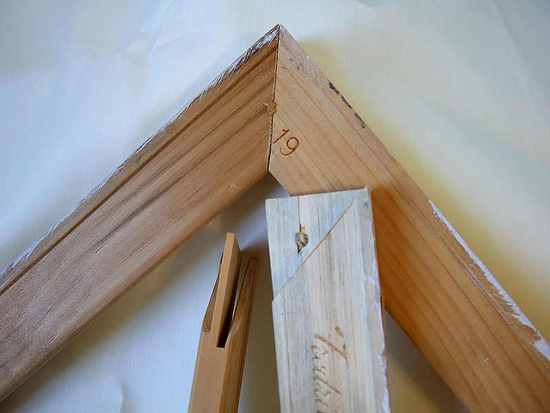
• Gently remove the painting from the frame and separate the watercolor from the glass frame immediately after it has become saturated. Mold also begins to form after saturation. Don’t leave the image in place pressed against the glass because the image will be bonded permanently to the glass.
• Lay the watercolor on a flat, dry surface. Leave the artwork untouched until completely dry. Lay the artwork on a towel, blanket or on dry grass in the yard.
• Mist the front and back of the watercolor with a light coating of spray Lysol. Do not substitute with a chemical that contains bleach. The damage incurred from the bleach is irreversible. Wait for the mold to dry out and become dormant. You will notice that the mold will become powdery.
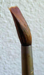
• Brush the mold off of the watercolor lightly with a clean, dry, soft-bristled paint brush.
• Put the painting back into the frame.

Dirt and Debris
• Break a loaf of bread in half. Grab a handful of the white inner portion of the bread. Roll the dough into a ball.
• Scrub the dough gently against the watercolor painting.
• Replace the dough as the piece you are working with gets dirty.
• Brush the bread crumbs off of the watercolor using a clean, dry, soft-bristled paint brush. Make sure that all bread crumbs have been removed from the painting.

Fade Prevention
• Instead of using an ordinary glass, use a UV3 coated Plexiglas. This will reflect the UV rays that cause the color to fade.
• Move any watercolor artworks away from direct sunlight. Artwork with the UV3 Plexiglas will not prevent all UV rays from damaging the color in the painting. Direct sunlight can harm the color and raise the temperature surrounding the painting that can fade the colors.
• Avoid hanging watercolor paintings where the temperature of the artwork would rise above 70 degrees Fahrenheit. Avoid hanging on outside walls that are not properly insulated, over fireplaces or near furnace grates and windows with direct sunlight.
• Replace all florescent lighting with incandescent light bulbs. Do not use direct lighting of any type on a watercolor.

Image source: www.paintingdemos.com

How to Frame Watercolor Paintings

Framing a watercolor painting is different from framing an oil painting on canvas. Know the purpose why you‘re framing your artwork and that is to display it in the best way and to protect it with a frame, mat and glass. Here are some easy steps and tips on how you can frame your own watercolor painting.

Framed02

Materials
Aside from glass, you need to protect the painting with a mat and backing (usually foam core), which should be acid free and archival, to prevent your painting from turning yellow overtime. Use a double mat because it looks better. You also need some acid-free cloth tape to attach the painting to the mat. The mat keeps the painting from touching the glass, which is very important. If you opt not to use a mat, then you need to put a spacer between the glass and the painting so they don’t touch.


Sizing
You have three options for acquiring mats and frames. The cheapest way is to buy a pre-cut mat and pre-made frame. Alternatively, you can purchase the equipment to cut your own mats, and even buy parts to assemble your own frames. Eventually you can save money by cutting your own mats, if you do enough of them, although I’ve found the mat material to be expensive unless bought in bulk. Finally, you can simply order what you need from a framer.

Frame
Finally, you need a frame. In general, the larger the painting, the wider the frame molding can be, but it’s all a matter of taste. Do, however, consider how the end result will look when you’re selecting molding. You don’t want to either overwhelm or underwhelm the artwork.

WatercolorFrameAssembly
Now that you have everything you need to frame your painting, you can now start assembling. Here’s how.
1. Wipe glass and make sure not to leave finger prints before placing in the frame.
2. Prepare you pre-cut mat and you can stack them inside the frame since they are thin. You can triple or double the matting with different colors if you want.
3. Surface could be plain paper, linen, silk, even leather, rice paper, can be textured and patterned.
4. Most mats are only available with a white core (the tiny part that shows when a bevel opening is cut). But a handful of mats do come with black core, green, red and yellow.
5. A common form of decoration on non cloth mats is the “French Line” or “French Panel”. These are lines drawn in ink or paint forming a rectangle around the opening. Could have several lines.
6. It is best to buy Acid Free mats. An acidic mat will fade and leak into the art work, causing “mat burn”, light brown marks.
7. So you have the matt, now attach picture with non acid tape to the mat. Place on glass.
8. Put the foam board, hold in place with framing points (look like small metal arrows).
9. Turn over, look at art work before inserting point in frame and across top of the foam board.
10. Lay the paper back attached to back of frame covering top to bottom, side to side (called dust cover).
11. Drive in fastners into back of frame, about 1/3rd down from top. String wire between fastners.

Image source: www.mimenta.com

Tips for Watercolor Painters: Brush Skills Part Two

painterlyPainterly Strokes
Dab an old #12 Serie 7 Winsor & Newton round red sable on a paint color and start by laying the full brush on the paper and lifting away cleanly. Try more short dabbing strokes across your paper. Rinse your brush and change colors. Keep your brush strokes uniform in width as you start to overlap strokes to develop shapes. Play with different groupings of brush strokes across your paper. Use as many color as you please. Continue laying down similar brush strokes trying different angles of attack. Allow your wet brush strokes to intermingle as you progress.

stabThe Stab
Start by dipping your brush into a color you want and gently poke or stab your brush into the paper. The effect that you want to see after doing this is to see a fanning pattern of the hairs as you push it into the paper. Continue doing this on your paper, adding some twist or spin to your stroke by rolling your brush in your fingers as you paint. Experiment with angles of attack to find the best spreading point for the brush you are using. Consciously try to shape the hairs as you press a stroke into the paper. Give it a little wiggle while the brush hairs rest on the paper to make them align. Rinse and switch colors and/or brushes. Continue to practice spreading and twisting your brush, building texture across the paper. Look for organic shapes and textures as you allow your strokes and colors to overlap and blend. This is another example of a what is considered a painterly stroke.

cutCutting Edges
“Cutting an edge” is a sign painter’s term for pulling a clean line of paint with your brush. A clean line being a line that is smooth and flowing with no irregularities. Consider each shape before you start to paint. You may lightly doodle the shapes first before painting. A round #8 Grumbacher Watercolor Classic red sable brush can be used in larger shapes a round #4 Kolonok 1001 Series Kolinsky sable for smaller shapes. If your brush is too full to get a proper point, touch it on a sponge, tissue, or towel to remove excess paint before you start. While you have one color in your brush try painting all the different shapes across the page in that one color. Rinse your brush out, switch colors, and repeat. For sharp corners use the very tip of your brush and start the brush stroke at the corner point of the shape. For circular shapes, start your curving brush stroke inside the edge of the shape and pull the stroke into position before continuing the stroke. Switch to a smaller brush and try some mini shapes.

Tips for Watercolor Painters: Brush Skills Part One

Practice makes perfect. Every skill that we learn is perfected through constant practice until we perfect them and becomes a second nature to us. Aside from being a talent, painting is a skill that needs to be honed and mastered. Other more experienced watercolor artists have developed different techniques that created their masterpieces that we can also use and here are some of them.

band of colorsBands of Color
Dip your watercolor brush into a color until loaded and start to paint a continuous wavy pattern across the paper. Keep the width of the strokes equal as much as possible. Add more paint to your brush as needed and continue where you left off until you reach the end of the paper. Rinse your brush and dip it in another color. Make another wavy line right next to the first one but make sure not to let the washes touch. Leave white paper between each stroke. Continue doing this until you fill the whole paper.

thick and thinThick and Thin
Choose a color or a combination of colors. Dip your brush into the paint and make sure it’s not too wet. Start a fine line using the tip of the brush first then start putting pressure on the brush to make a thicker stroke then lessen the pressure until the line thins out again. Do this without lifting the brush off the paper. Reload your paint brush as needed. Rinse your brush and use other colors to make more lines using the same technique until you fill the paper. You can try to thicken your stroke where the adjacent line is thin, but in particluar, avoid touching the other washes with the new colors you lay down. Being able to instinctively thicken or thin a brush stroke on command while you are painting, and have it go where you want it, is a good preparation for your future masterpieces.

flickWrist Flick
The Wrist Flick is easily done with a decent round red sable or a rigger-style brush. Put paint in you brush and position the tip of the brush pointing towards you. Push the brush tip upward with a flicking motion creating a feathery point at the last part of the stroke. One technique that you can use is you can rest your brush hand on top of my other hand for stability and control of detailed flick strokes. Practice several times in each color you have. Vary the thickness of the strokes as you try to imitate grasses, branches, or even feathers.

There are more of these techniques. Watch out for par two!

Watercolor Paintings by Vincent Van Gogh

Scheveningen Woman Etten: November-December, 1881 (Amsterdam, Van Gogh Museum)
Scheveningen Woman
Etten: November-December, 1881
(Amsterdam, Van Gogh Museum)

“What a splendid thing watercolour is to express atmosphere and distance, so that the figure is surrounded by air and can breathe in it, as it were.” – Vincent van Gogh

Although Van Gogh’s watercolour paintings are not as well known as his oil paintings, he produced 148 watercolor paintings during his life and perfected this skill. His fondness in watercolour are very evident through his letters to his brother Theo. At the age of 28 Vincent wrote the following in a letter to his brother Theo in December 1888:

“I came away from him with some painted studies and a few watercolors. They are not masterpieces, of course, yet I really believe that there is some soundness and truth in them, more at any rate than what I’ve done up to now. And so I reckon that I am now at the beginning of the beginning of doing something serious. And because I can now call on a couple of technical resources, that is to say, paint and brush, everything seems fresh again, as it were.”

In the same letter he wrote:

“I wish you could see the two watercolors I have brought back with me, for you would realize that they are watercolors just like any other watercolours. They may still be full of imperfections, que soit, I am the first to say that I am still very dissatisfied with them, and yet they are quite different from what I have done before and look fresher and brighter. That doesn’t alter the fact, however, that they must get fresher and brighter still, but one can’t do everything one wants just like that. It will come little by little.”

Aside from drawing, Van Gogh often did watercolors as studies before doing an oil painting or as practice. Though often lacking his distinctive brush stroke textures, the watercolors are unmistakably Van Gogh in their use of bold, vibrant color. Often times, these watercolors were used as field studies for their eventual larger oil counterparts.

Initially, van Gogh would use watercolors to add shades to his drawings but the more he used them, the more these pieces became works of art in their own right. As Van Gogh continued to refine his technique, he used more and brighter colors in his watercolors. Over time he became more comfortable working with watercolors and was able to work quickly with them to produce more impressive works.

The watercolor paintings of Van Gohg distinguish themselves as a vibrant and important part of his overall oeuvre. Vincent Van Gogh‘s use of colour is, as always, marvelous and his watercolour works stand out as a remarkable achievement in the course of his constantly evolving art.

Image source:  www.vangoghgallery.com

Watercolor Painting Supplies for Beginners

Watercolor is one of the most versatile mediums to work with that you can paint your subjects from very controlled and detailed, to very loose and impressionistic. It is exciting and enjoyable but challenging and a bit frustrating at the same time. Now that you’ve decided that you want to try watercolor as a medium, you need to start somewhere and that is to know your materials.

watercolor

Paper
Watercolor paper is essentially blotting paper marketed and sold as an art paper, and the two can be used interchangeably, as watercolor paper is more easily obtainable than blotter and can be used as a substitute for blotter. Lower end watercolor papers can resemble heavy paper more while higher end varieties are usually entirely cotton and more porous like blotter. Watercolor paper is traditionally torn and not cut.

Paint
Watercolor paint consists of four principal ingredients: pigments, gum Arabic, additives and solvent. The term watercolor refers to paints that use water soluble, complex carbohydrates as a binder. Originally (16th to 18th centuries), watercolor binders were sugars and/or hide glues, but since the 19th century the preferred binder is natural gum arabic, with glycerin and/or honey as additives to improve plasticity and dissolvability of the binder, and with other chemicals added to improve product shelf life.

Palette
Cake and Pan watercolor sets usually have built-in fold out palettes that are useable in varying degrees depending on their size and orientation. For your tube watercolors you can use a flat white dinner plate or buy some inexpensive 6 or more welled plastic palettes like the ones you used in grade school for your tempera paints. A covered plastic palette makes for the least waste and most convenience if you are using tube watercolors. If you are getting serious, buy one.

Brushes-water-bent-150258Brush
A #8 round red sable watercolor brush is the best beginner brush to buy most especially when you can afford only one brush. Adding a round #4 and a 1″ flat would come in handy for detail work and large washes. Most manufacturers have starter sets that contain very usable equivalents.

Water
Find a glass or jar, or small bucket to hold fresh, clean water. Use two for rinsing your brush between colors, and for clean water for painting. Avoid hard water for it decreases paint solubility and flow. Tap water is usually fine

Extras
Some minor extra things that you will need in you watercolour kit is a pencil, a kneaded eraser, some tissues, and an old towel or paper towels, and a couple of large metal clips for holding your watercolor paper to a board.

Image source: watercolorpainting.com

World’s Top Schools for Studying Arts

Academy of Fine Arts Vienna
Founded 1698, Vienna’s Academy of Fine Arts is divided into the Institute of Fine Arts (including the departments of abstract painting, art and digital media, art and photography, arts and research, conceptual art, contextual painting, expanded pictorial space, figurative painting, graphic arts and printmaking techniques, object sculpture, performative art-sculpture, video and video installation and textual sculpture), Institute for Art Theory and Cultural Studies, Institution for Conservation and Restoration, Institute for Natural Sciences and Technologies in Art, Institute for Secondary School Teaching Degrees (in craft, design and textiles) and the Institute for Art and Architecture.

220px-AkadBildKWien

Yale School of Art
Yale School of Art is rated the best in the United States for its Master of Fine Arts program as of 2013. Established in 1869, the Yale School of Art is one of the 12 constituent schools of Yale University. It grants a Masters of Fine Arts degree to those who have completed their studies in graphic design, painting or printmaking, photography or sculpture. Yale offers courses in all of these four interrelated fields.

Accademia di Belle Arti di Firenze, Italy
Located in Florence, Tuscany, the Accademia di Belle Arti di Firenze (“Academy of Fine Arts of Florence”) was founded by Cosimo I de’ Medici, Grand Duke of Tuscany, Michelangelo and Giorgio Vasari in 1563. Originally, the Academy’s members were the eminent artistic personalities of Cosimo Medici’s court, supervising artistic production in the area. In 1784, all the schools of drawing in Florence were combined into one single institution, known as the Accademia di Belle Arti from then onwards. Since 1783, the Accademia Gallery has housed the original David by Michelangelo.

Royal Academy Schools, England
The Royal Academy Schools form the oldest art school in Britain and the only institution to offer a three-year post-graduate art course. They offer an unparalleled opportunity for students to develop their work over a three year postgraduate programme. The Academy provides free tuition to its students, contributed by Members of the Royal Academy. Disciplines such as painting, sculpture, print, installation, time-based media and digital media are taught.

École nationale supérieure des Beaux-Arts, France
Founded in 1648 by Charles Le Brun, The École nationale supérieure des Beaux-Arts is is the distinguished National School of Fine Arts in Paris, France. Studies at the school include painting, installation, graphic arts, photography, sculpture, digital media and video. Additional theoretical courses are supported by technical training and access to technical facilitiesThe collection of the school includes around 450,000 items, containing artwork and historical books.

Athens_School_of_Fine_Arts_(emblem)

Athens School of Fine Arts, Greece
Established in 1837, The Athens School of Fine Arts is Greece’s premier art school whose main objective is to develop the artistic talents of its students. As of 1840, the program for fine arts included painting, sculpture, architecture, lithography, woodcut, geometry and cartography. In 1910, the faculty was made independent of the National Technical University. This was also the year in which women were first allowed to study at the School of Fine Arts.

Image source: www. wikipedia.com

Famous Abstract Paintings

Abstract paintings are in its purest form and have no identifiable object. It is a visual language that awakens emotions, imagination that feeds the soul. Many famous abstract artists expressed themselves through abstract paintings which paved their way to fame. Through the years, they have different painting techniques and styles that created a whole new world for fine arts. Here are some of the most famous paintings that changed the whole perception of abstract art.

“Composition VIII” (1923) –Composition VIII by Wassily Kandinsky is small oil on canvas painting dating from 1923. This geometric composition communicates to the world through the use of shapes, colors, and lines. It is currently in the Guggenheim Museum in New York.

“Black Square” (1915) – “Black Square” is the first “suprematist” work of Malevich. Black Square against white background became the symbol, the basic element in the system of the art of suprematism, the step into the new art. The painting is the ultimate picture of pure abstraction. The artist himself created several variants of the Black Square. All four are different not only the sequence and year of creation, but also the color, design and texture.

black square
Black Square
Kazimir Malevich
Image source: http://www.hermitagemuseum.org


“Number 1” (1948) – Jackson shows how much paint can be “unrestricted, unexpected, uncontrolled” as we see it poured onto a canvas making lines that are assertive, and we also see a complexity of shapes, globs, pools of paint layered one on top of another. Paintings like this are unique because the artist’s actions, strengths, and energy could be reflected in the art.

“Dantrolene” (1994)– This painting is one of the most famous contemporary abstract paintings that could surpass a lot of present art available for sale. Painted by Damien Hirst, the viewers are amazed by the pigments portrayed in the painting. They will search for deeper images that their minds are forced to create. In the end, endless emotions and assumptions will be extrapolated from this painting.

dantrolene
“Dantrolene”
by Damien Hirst
Image source: http://www.mutualart.com

“Les Demoiselles D’Avignon” (1907) – The painting made by Pablo Picasso depicts four women in a brothel that are not fully abstracted. Each figure is depicted in a disconcerting confrontational manner and none are conventionally feminine. This lack of abstraction does not reason the paintings’ exclusion from the list of the most famous abstract paintings.

“Woman I” (1950) – De Kooning described the figurative motif of this painting not as a representation but as a thing slapped on the canvas, liberating him from formal anxieties. The main attraction of the work is the painful and angry image of an abstracted woman, hence the title of the painting. This “woman” is exaggeratedly, absurdly physical and at the same time not there at all, a spewed monster of fantasy, a crude graffito that took two anguished years to paint.

Dutch Master Rembrandt and His Most Famous Works

485px-Rembrandt_Harmensz._van_Rijn_135

Today is Rembrandt’s 407th birthday!

Born Rembrant Harmenszoon van Rijn in 1606, he is the most celebrated Dutch artist and is considered as one of the greatest painters in European art history. Most of his masterpieces are self-portraits, portraits of other artists, and depictions of religious and historical themes. Art experts claim that Rembrandt was able to create more than 600 paintings, 400 etchings, and 2,000 drawings, but these figures are not certain.

Here are some of Rembrandt’s most famous works:

The Return of the Prodigal Son. This is an oil on canvas painting finished circa 1669. It is one of Rembrandt’s final works. The Return of the Prodigal Son depicts a parable from the Bible about a prodigal son returning to his father after wasting his inheritance. In the painting, you’ll notice the ragged state of the son’s clothing, kneeling and repentant in front of his father who was garbed in rich clothing. The expressive lighting and coloring in the painting effectively evoke repentance, compassion, and forgiveness.

The Anatomy Lesson of Dr. Nicolaes Tulp. Rembrandt was commissioned to paint this group portrait, The Anatomy Lesson of Dr. Nicolaes Tulp. The painting portrays a group of surgeons, surrounding a table while studying a corpse. Specialists have commended Rembrandt for the accuracy of the muscles and tendons of the corpse’ dissected arm. Rembrandt was 26 when he created this painting. The painting is displayed in the Mauritshuis museum in The Hague, the Netherlands.

The Return of the Prodigal Son by Rembrandt, c. 1669.

Danaë. Rembrandt portrayed Danaë, the mother of Perseus in Greek mythology. The 1636 painting shows his interpretation of the myth where Danaë waits for Zeus who impregnated her. It is a life-size painting, measuring 185 cm × 203 cm. Danaë is housed in the Hermitage Museum, St. Petersburg, Russia.

Jacob de Gheyn III. Jacob de Gheyn III is a portrait of one of Rembrandt’s contemporaries who was a Dutch Golden engraver. The painting measures 29.9 x 24.9 centimeters and because of its small size, it has been stolen four times since 1966. It is called “takeaway Rembrandt” due to the numerous theft incidents, the most recorded of any painting.

Belshazzar’s Feast. Belshazzar’s Feast is a 1635 painting portraying the Biblical story of Belshazzar and the writing on the wall. The setting is at a banquet wherein the characters show alarm, surprise, and amazement as they look at the handwriting on the wall. Rembrandt effectively used the technique called Chiaroscuro, wherein he manipulated light and shadow to give contrast and create volume and give a three-dimensional effect on objects.

The Night Watch. The Night Watch is the best known painting housed in the Rijksmuseum, Amsterdam, the Netherlands. The painting was commissioned by Captain Frans Banning Cocq who was one of the main characters in the artwork. It is widely known for its size (11.91 ft × 14.34 ft), effective use of Chiaroscuro, and perception of motion.

Image source: www.wikipedia.org

Types of Stretcher Bars

Stretcher bars play a major role in the appearance of a canvas artwork or Giclee printing. The quality of wood and the structure of the stretcher are the key to easy stretching which produces a better print quality and longer life for a canvas. It is also important that you choose the right stretcher for your canvas depending on the type of canvas you will use, the size of your artwork and weight and texture of the weave of the canvas. The following are the types of stretcher bars and their uses.

stretchers

Medium/Standard Duty
Medium duty stretcher bars are the standard stretcher bars with raised and rounded edges which significantly reduce the friction of stretching. It provides a tighter and more even canvas face. It also reduces the stress placed on the canvas and the person doing the stretching, as pliers lever the canvas around the frame.

Light Duty
Light duty stretcher bars are great for those smaller paintings or giclee prints that will be framed or won’t benefit from a thicker bar. They have a beaded (rounded) edge that holds the canvas and flat part of the bar slightly apart. The rounded edge greatly relieves the stress on the canvas and person framing. A tighter, more uniform stretch is the result of this feature because the canvas flows around the smooth edge.

Medium/Heavy Duty- Goldilocks
Goldilocks medium or heavy duty stretcher bar is an expensive option because it is in demand for those who require a substantial side profile for their valuable art work. It adds to the intrinsic value of the art without having to spend more. This stretcher profile is frequently used for the stretching of giclee and other prints.

800px-Light_stretcher_bars_assembled_disassembled_051907

Heavy Duty-Midi
Heavy duty Midi bars offer you an exceptional quality at a very reasonable price. Like all other gallery wrap stretcher bars, their edges are created to impart a smoother stretching with less resistance. These light-weight bars are also perfect for reducing the overall weight of the frame. Straight-grained and lightweight these bars are perfect for also reducing the overall weight of the frame.

Super Heavy Duty
The super heavy duty gallery wrap stretcher bars are known for their impressive mass as well as strength. It is very useful when you have to stretch that large canvases and paintings. It is also ideal for smaller frame applications where very high tension is required. They are usually made with a brace at the back for added strength.

Image source: commons.wikimedia.org