Tagged: oil painting

What are the Solvents Used in Oil Painting?

solvents

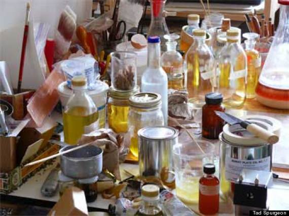
“Solvent” is the term most commonly used to identify the liquids that are added to oil paints to temporarily change the way they work when put on canvas. Solvents dilute oil, and dissolve fats and grease from oil paints. Aside from diluting oil paints, artists use solvents to dissolve resins and clean up the work area and paint brushes.

Solvents may have different uses but they have common characteristics:

  • Liquid
  • Volatile
  • Produce vapors
  • Flammable
  • May be hazardous to health

You may think that you should forget using solvents since they are harmful to your health, but with proper precaution and  care of use, you’ll appreciate the benefits solvents bring to a painter’s work. There are many solvents available to an oil painter but you can just select a few for your work.

Turpentine. Turpentine is the traditional solvent used in oil painting and is commonly found in hardware stores. It easily evaporates and gives off harmful vapors which causes skin irritation. When buying, choose artist quality turpentine which is colorless, since the industrial type of turpentine may contain impurities. Turpentine is mostly called as “turps” and can also be called spirit of turpentine, oil of turpentine, genuine turpentine, English turpentine, distilled turpentine, and double rectified turpentine.

Mineral Spirits. Mineral spirits or paint thinner is best used for cleaning paint brushes and thinning paints. It is less expensive and less abrasive compared to turps but it still releases harmful vapors so take precaution when using it. Mineral spirits is also called “white spirits.”

Odorless Mineral Spirits (OMS). As the name says, Odorless Mineral Spirits doesn’t have an unpleasant odor which makes it more expensive than ordinary mineral spirits. It is used for thinning paint and cleaning brushes. OMS is available in different grades, depending on the amount of aromatic properties removed from it. The more refined the OMS, the safer it becomes.

Paint thinner. Paint thinners are synthetic-based solvents. Contrary to its name, it is more effective in cleanup than as a diluting substance of oil paints.

Citrus-based thinner. Citrus-based thinner has a pleasant smell and is used to clean brushes and dilute oil paints. It has a yellowish color and a citrusy smell. Use it with oil paints to dry the painting faster. It is a more environmentally-friendly solvent than turps.

Turpenoid. Turpenoid is a popular synthetic solvent that is odorless and colorless which is used as a substitute for turps.  It is great for diluting oil paints as well as cleaning brushes.

Image source: http://www.huffingtonpost.com/

Tips for the Maintenance and Handling of Oil Painting

maintenance_Evans
Maintenance by David Larson Evans, 2012.

Oil paintings, whether you created yourself, acquired from an auction or an heirloom, have much value. You have to take care of its maintenance, handling, and storage. Paintings last a long time and to lengthen its beauty and life, proper care must be given to them. Museums and art galleries spend a lot and they go at great lengths just to keep and safeguard their paintings. As a painter or as an art collector, you must know some information on the maintenance and correct handling of your pieces. Here are some tips:

1. Handle the oil painting by the frame. Don’t touch the painting surface to avoid leaving natural oils from your skin.

2. An oil painting canvas is pliable, so don’t put an object at the front and behind the painting which could press the painting and leave a dent, or worse, cause a tear. If there is damage in the painting, you could do your own repair but if the piece is an heirloom or has much value, it’s better to ask a professional art restorer to do the repair.

3. When transporting an oil painting, place cardboard or thin plywood on both sides of the painting and put bubble wrap around it to secure the painting. Don’t stack paintings on top of the other.

4. When you are permanently storing a painting, put it in a custom-sized plywood container and brace the painting to avoid movements. Don’t store the painting in your attic or basement since the environment in these rooms are not favorable for paintings.

5. Don’t expose your painting under direct or extreme sunlight, cold, or humidity. These conditions will cause the paint to fall off, weaken the canvas in time, and ultimately damage your painting.

6. The best place to “store” a painting is by displaying it on a wall. Paintings are created to be viewed and admired, not to be hidden under the basement. Hang it in a place without extreme temperatures. Don’t hang it near or across a window, fireplace, or any room with much humidity.

7. Don’t hang paintings in hallways or any room where there are lots of movements and where it can be knocked or scratched. The best room for a painting would be a room where people are comfortable, a room where the temperature is controlled, not much heat or cold. Keep your paintings away from fireplaces, heaters and radiators.

8. Use two hooks when hanging a painting to provide enough support and balance. The painting should be high for people to see but not too high to put a strain on the viewer’s neck. If you are hanging a painting in your living room, the best spot is above the sofa, above head height of anyone sitting.

9. Use a soft-bristled brush to dust the surface of the painting to prevent dust from accumulating.

Image source: http://www.dailypainters.com

How to Repair a Damaged Canvas

You’ve finally finished your masterpiece. After hours and days laboring on your painting, carefully putting your inspiration on canvas, you’re excited to display it. Unfortunately, you or someone else accidentally ripped a small area on your painting. What do you do?

Don’t panic. There are two ways to repair a torn, ripped, punctured, or damaged canvas: patching or lining. Before fixing your canvas, you have to consider some factors that would affect the end result of your repair. If the damage is small, patching would be a good remedy. Patching is a quick and easy solution to tiny punctures, L-shaped tears, and small tears. For damages affecting a large area or if the small tears are located in several areas, lining is the best way to fix the canvas. For old oil paintings, professional art restorers prefer to do lining since most aged canvas are brittle, fragile, and more susceptible to damage when not reinforced.

tear-canvas-repair

Patching
Here are the steps for patching a canvas:

1. Smooth out the area where the tear is located. Clean up any fibers that may have unraveled.

2. Cut a piece of canvas with at least an inch wider than the tear. If you have a lighter weight canvas than the one you’re repairing is best to use.

3. Glue the patch at the back of the tear. Use acrylic-gesso or an acid-free glue in patching. Apply a thin layer of glue to the patch. If you use too much glue, it will only squeeze out of the patch and get on the front of the canvas which will leave an unnecessary stain.

4. While the glue is still wet, check the tear at the front of the canvas. Use a pair of tweezers to put back loose threads in place. Carefully arrange the threads to fill the damage.

5. Inpaint the patched area, if needed. If it’s your own work, it would be easier to repaint the repaired area.

Tips:

  • Work with patience and care.
  • Hire a professional art conservator or restorer for fixing valuable and antique paintings. They can do a more refined repair of an old painting.
  • Patching done in a busy area of the painting is less noticeable than a patch in a solid area.
  • Just because the patch is located behind the canvas, doesn’t mean you will do a sloppy repair. Make the patch neat and professional-looking so if someone sees the repair, they won’t be dismayed with the whole painting.

Image source: http://painting.about.com

The Most Reproduced Oil Paintings in the World, Part 1

Poppy_Fields_near_Argentuil_Monet
Poppies, Near Argenteuil, Claude Monet, 1873.

Art students can learn painting techniques and styles by copying famous paintings in art history. Copying trains your hand and eye coordination and lets you get a deeper appreciation of the arts. You can learn the different styles and painting techniques by studying these notable paintings. It inspires you to create something beautiful as well.

In 2010, OverstockArt.com, an online business that sells painting reproductions, revealed the top 10 list of most reproduced paintings. If you are thinking which painting to copy, check out this list for inspiration.

1. The Starry Night by Vincent van Gogh
The Starry Night is among Vincent van Gogh’s most celebrated works. The subject of the painting is the night scene in the village Saint-Rémy-de-Provence, southern France. It was painted during the time Van Gogh spent inside an asylum in the same village. The painting is filled with movements and contrasts, from the colors used to the quietness of the village vis a vis the swirling night sky.

2. Café Terrace at Night by Vincent van Gogh
Vincent van Gogh was fascinated with nocturnal motifs and Café Terrace at Night was no exception. He was known for his innovative use of lines, textures, and colors. You can see the contrast between the yellows and blues to black paint he used in this piece. The roughness of the cobblestone street is a direct contrast to the smoothness of the cafe.

3. The Kiss by Gustav Klimt
The Kiss is an oil and gold leaf on canvas. It depicts a couple embracing with elaborate robes and ornamentation. Gustav Klimt used the Art Nouveau style in this painting. The male figure is identified with squares and rectangles while the female figure has circles and soft lines. The couple is intimately entwined while the rest of their bodies dissolve in a shimmering flat pattern.

4. Poppy Fields near Argenteuil by Claude Monet
Claude Monet lived in Argenteuil, France from 1871-1878. The countryside became a great inspiration for Monet. The vast, bright landscapes around the region allowed Monet to experiment plein-air painting. In the painting, you’ll notice that he used blobs of paints to represent the poppies and trees, creating just an impression of the landscape.

5. The Mona Lisa by Leonardo da Vinci
One of the most famous paintings in history, The Mona Lisa has been reproduced and copied by many artists. Leonardo da Vinci used the technique called sfumato wherein he used subtle gradation of tone and color. This technique blurs and softens the contours of the outline, creating an atmospheric effect and the facial features seem real.

Image source: http://www.webexhibits.org

The Beauty and Popularity of Photorealism

American author and art dealer Louis K. Meisel coined the term “photorealism” in 1969. It refers to a genre of painting based on using photographs as basis for a realistic and photographic art work. This movement started in the late 1960s and early 1970s. During that time, artists captured images of their subjects to gather visual information and used these photos in their paintings.

To give a definite definition for an artist to be considered as a photorealist, Meisel released these 5 points:

  1. The Photo-Realist uses the camera and photograph to gather information.
  2. The Photo-Realist uses a mechanical or semimechanical means to transfer the information to the canvas.
  3. The Photo-Realist must have the technical ability to make the finished work appear photographic.
  4. The artist must have exhibited work as a Photo-Realist by 1972 to be considered one of the central Photo-Realists.
  5. The artist must have devoted at least five years to the development and exhibition of Photo-Realist work.
crayola_flack
Crayola by Audrey Flack, 1972-73.

The cool thing about photorealism is that you can mistaken a photorealistic painting as the actual photo. You’ll be surprised how a painting can look fantastically as the real thing. Many artists who are called photorealists have experimented and became popular in this painting style such as Charles Bell, Audrey Flack, Tom Blackwell, and Raplpf Goings. They use ordinary, mundane objects as their subjects such as food, flowers, beaches, diners, etc.

Before creating a photorealistic painting, artists create several studies of the subject to learn its composition, colors, shadows, form, and perspective, much like a mock-ups. From these studies, they can try to tell which element or area could become a problem when painted in large-scale and they try to find a solution. These artists gave attention to the minutest details of the subject and they try to portray subjects as accurately as possible, a total opposite of the Abstract Expressionist movement.

Between_Two_Places-Zener
Between Two Places by Eric Zener

You may ask, why create a photorealistic painting that take days or even months to finish when you can just take the subject’s picture? The answer: technical virtuosity and enigma. It’s fascinating to look at these paintings because you’ll think they’re “real” but they’re not, because they’re paintings.

Many contemporary photorealists have created art works using water (swimming pools, bathrooms, water splashes), reflections (mirrors, glasses, bottles), food from freshly cooked to packaged ones as subjects. The colors are vibrant, vivid, and intense, it looks like you can almost touch the subject of the painting. Amazing, right?

Image sources:
http://www.audreyflack.com
http://www.escapeintolife.com

Learn the Oil Painting Technique: Wet into Wet

Also known as Alla Prima (Italian for first attempt), wet-on-wet means you simply paint over wet paint. The goal in this technique is to finish the whole painting before the first paint dries therefore working fast is the key. Here are some things that you need to know about wet-on-wet painting.

morris hinson1

• You start the wet-on-wet technique using thinned oil paint for drawing. Then you place spots of colors all over the painting to fill it in because the sketch usually dissolved or over-painted as the painting progresses. The painting can be adjusted slightly with glazes and highlights after it dries.

• Blending colors is easy with wet on wet technique. You can directly place one color onto your canvas, and then add other colors and blend with brush or knife to you desired shade. But you have to make sure that you mix colors rapidly and with clear understanding of color theory and keeping in mind the form that you’re trying paint. Expertise with brushwork is very important to do the trick.

• The beauty of wet-on-wet technique is that it sustains the fresh and spontaneous inspiration that come as you paint. For me it is the most intuitive way to paint. Creating a portrait with the technique will require expertise in mixing colors to match your subject.

• It may require few layers of paint to complete the painting, in which case it is easy to overfix the paints, which can look labored and weak. This is the stage where many beginners give up, but if you press on, you can master wet-on-wet technique and create works with the amazing freshness and spontaneity that only wet on wet can provide.

morris hinson2

• When working wet-on-wet pull the brush along its length with the handle close to the surface. You get two strokes with a flat bristle brush, one side then the other, look at the brush for any paint it picked up and wipe it. Think of the brush hairs as if they were the fingers on your hand stroking the surface. This method allows wet paint to go over another (wet) color with clean results.

Using this technique have its advantages. One is you don’t need fine drawing skills. Blending is also quite easy in this technique so you don’t need extensive blending of colors. Lastly, your paintings can be completed quickly (about 2 hours to 2 days only) because you have to make sure that you’re working on wet paint.

This technique is quite advanced and requires a bit of painting experience. Using the Wet-on-Wet method, a dedicated practice and experimentation are all that is necessary to achieve masterpieces that you never imagined you can possibly do.

Paintings by Morris Hinson http://www.thumbartsguild.com/artist/mhinson.html

Learn the Oil Painting Technique: Blending

Color blending is a technique wherein two colors are combined to create another color. Each color has a separate blend factor that determines how much of each color is combined into the final product. There are different ways to blend colors and different ways with different medium. Today, I will share some techniques in color blending using oil paints.

blue_blend

How to start?
Once you’ve decided what colors you want to blend to create an effect, you might want to blend small amounts of each and check if it’s the color you’re looking for then you can make necessary adjustments. Move the brush in a way from one color into the other and back or in a zigzag motion. Wipe off any paint from your brush before you start blending or better yet, start with a clean, dry brush so you won’t add any extra paint that is not part of your color scheme.

Indigo sunset original oil painting, seascape  by Gina De Gorna
Indigo sunset original oil painting, seascape
by Gina De Gorna
Image source: http://sunsetartonline.com

How to blend on canvas?
You don’t want the colors mix equally so stroking your brush sideways at least initially or else you’ll have strips of concentrated colors in your blended color. Remember to keep your strokes short and picking different percentages of blending. Keep repeating until it blends. As your tip gets thinner you get a smoother result, and once is smooth enough you can use blur or smudge tool to finish the job in case you want perfect gradients. If you think your blended color is not blending well or it’s too concentrated on canvas, all you need to do is to pick up a little fresh paint in the color that’s at risk of being lost then work from the outside or the darker shade until its blended. You can take your time blending with oil paints because they dry slowly unlike with acrylic paints.

flat-brushWhat type of brush and brushstroke is best to use in blending?
Create a transition between the first two shades using a crosshatch stroke. Flat brushes tend to work best for blending. Smooth the blend by using parallel strokes along the transition you just created. The parallel strokes should be perpendicular to the lighter shades. Use a clean brush to blend the next shade, and repeat the technique using first crosshatched strokes followed by parallel stokes. A clean brush should always be used when working with a new shade, even if the actual color is the same.


Franz Kline: Master of Black and White

“I paint the white as well as the black, and the white is just as important.” – Franz Kline

When we talk about paintings, we visualize canvases filled with several colors portraying an extensive array of subjects. However, one artist became popular during the Abstract Expressionist movement in the 1940s to 1950s because of his black and white paintings.

Franz Kline is an American Abstract Expressionist is widely known for his large-scale black and white abstract paintings. In his early years as a painter, he started as a realist and primarily influenced by Old Masters. When he stayed in New York during the 1940s, he became friends with abstract expressionists including Willem de Kooning and Jackson Pollock which helped him develop another style and he was influenced to work with abstractions.

Kline’s abstract paintings are described as “dynamic,” “spontaneous,” and “intense” earning him the label as an “action painter.” He only used black and white paints on most of his works but nonetheless, they still show his intense style and less focus or no focus at all on the actual imagery. His works have been interpreted as landscapes, cityscapes, bridges, buildings, railroads and other industrial subjects. Some also likened his style to Japanese calligraphy. Kline denied any hidden message behind his paintings which interested a later generation of Minimalist artists.

Here are some of his celebrated works:

No._2_Franz_Kline
Painting Number 2

Painting Number 2 (1954)
Painting Number 2 is an oil on canvas measuring 6′ 8 1/2″ x 8′ 9″. It is displayed at The Museum of Modern Art.

Painting_Number_7_Kline
Painting Number 7

Painting Number 7 (1952)
Painting Number 7 is one of Kline’s best examples of black and white artworks. It shows broad, geometric black lines.

Untitled_Kline
Untitled

Untitled (1952)
This oil painting is done on paper which is mounted on canvas. It shows Kline’s signature strong, block lines.

Unfortunately, Kline has no catalogue raisonné or an official listing of his artworks. Many forgeries of his works have been traded and it is difficult to prove the authenticity of the paintings being offered in art auction houses. An article revealed that at least nine Kline paintings which have been traded in Christie’s (London and New York), Koller (Zurich), and Tajan (Paris) may have been fakes. There lack of catalogue raisonné risks private collectors and major auction houses in buying a seemingly original Kline painting which in the end would turn out to be just a forgery.

Image source: http://www.guggenheim.org/

Learn the Oil Painting Technique: Underpainting and Glazing

Underpainting

It is an initial layer of paint that will serve as a foundation and help define subsequent layers of paint for your painting. Underpaintings are usually monochromatic which reflects light through the over-painting layers and gives a painting the luminosity. There are several different methods of underpainting were used by the old masters.

umber5
underpainting


umbercomplete
underpainting effect

· Grisaille
Pronounced as “griz-eye” this is a method of underpainting with different gray paints.

· Verdaccio
It is a method of underpainting with colors of olive or green gray paint in the light areas. It often resembles a moonlight effect.

· Imprimatura
This underpainting method usually uses transparent layers of earth colors (ra umber or burnt umber). It is used as first stain to tone the canvas.

· Wash-in Underpainting
A variation of the Imprimatura underpainting. The subject or composition can be drawn into a thin semi-transparent layer of raw umber or burnt umber. Rags, paper towels and paint brushes are used to lift out the paint exposing the lights to illuminate the subject.

Glazing

Glazes can change the hue and texture of a surface. Drying time will depend on the amount and type of paint medium used in the glaze. Different media can increase or decrease the rate at which oil paints dry. Oil paits usually takes longer to dry. If a paint is too opaque, painters will add special media or a lot of medium to the paint making them more transparent for the purposes of glazing. Glazing has the strongest impact on showing middle tones and dark colours.

Reproduction of Girl with a Red Hat by Jan Vermeer
Glazed reproduction of “Girl with a Red Hat” original by Jan Vermeer

Here are some tips on how to glaze oil paintings.

· Begin the oil painting as usual by sketching and putting visual resources as necessary, but do so as though the painting were going to be complete in one layer.

· Once completely dry, after a week or so, begin the next layer of paint. The glazes will soften the colours and deepen the tones. Each “glaze” slightly modifies the colour of what has already been painted on the canvas. When you look at it the colours are automatically mixed optically giving a rich deep colour.

· Putting a little linseed oil into the oil paint will create a translucent colour. Oil paint comes in transparent, semi-transparent, and opaque and you will learn which is which the longer you paint with oils. All paint colours can be used as glazes, even opaque paints, used as glaze to paint mist or fog.

· Apply the oil paint glaze onto selected areas. A second layer of slightly darker colour will deepen the colour without changing it completely.

Image source: www.easy-oil-painting-techniques.org

Most Famous Women in Paintings in the World Part 2

NPG 2082; Queen Elizabeth I by Unknown artist
The Darnley Portrait

Yesterday, I listed the women who were immortalized through paintings by famous artists. Now is the second half of this list.

6. The Darnley Portrait (circa 1575) by Unknown Netherlandish artist
The Darnley Portrait became the official template or face pattern of England’s Queen Elizabeth I in the 1590s. This portrait was constantly reused for all of the Queen’s official paintings in the said period. It shows the Queen with her crown and scepter, the symbols of sovereignty.

7. Girl with a Pearl Earring (circa 1665) by Johannes Vermeer
The Girl with a Pearl Earring is an oil on canvas masterpiece by Dutch painter Johannes Vermeer. It is considered the “Mona Lisa of the North” and the “Dutch Mona Lisa.” As with Vermeer’s other works, the true subject of this painting is unknown. There are several theories as who is the girl in the painting and many say that it is Vermeer’s eldest daughter Maria Magdalena.

8. Fritza von Riedler (1906) by Gustav Klimt
Gustav Klimt mainly painted with women as subjects and one of his paintings is Fritza von Riedler. It is one of the first portraits that Klimt created which shows a woman who is sitting and is adorned with frothy lace in her gown and satin ribbons on her head. The painter filled the canvas with decorative elements, similar to the Portrait of Adele Block-Bauer. Not much is known about the woman behind the painting but it is one of his most famous paintings.

9. L’Arlésienne: Madame Joseph-Michel Ginoux (1888-89) by Vincent van Gogh
The subject of Vincent van Gogh’s L’Arlésienne painting was Marie Ginoux, the owner of the Café de la Gare in Arles, France where the painter lived for a few months. Van Gogh created several versions of the painting which depicts Marie seated at a table with books. The first version was painted on burlap and the second version was on a pre-primed canvas and instead of books, Van Gogh put a parasol and gloves in the painting.

10.Portrait of Madame X (1884) by John Singer Sargent
The Portrait of Madame X, also known as Madame X, is a portrait of a young socialite Virginie Amélie Avegno Gautreau, wife of Pierre Gautreau. The subject was in a standing pose with her head turned to the left, creating a profile. The painting created a scandal among the Parisian elites as it showed the socialite in a low-cut black satin dress, unflattering white make-up, and one dress strap hanging off one shoulder.
Image source: http://www.npg.org.uk/